Scalable Email Design
Email designs balancing storytelling, structure, and performance.
Overview
Email is one of the hardest surfaces to design well. You're working within tight technical constraints — rendering inconsistencies across clients, limited interactivity, legal copy requirements — while still needing to communicate clearly and drive action. Every layout decision has to work at a glance, because most people won't read.
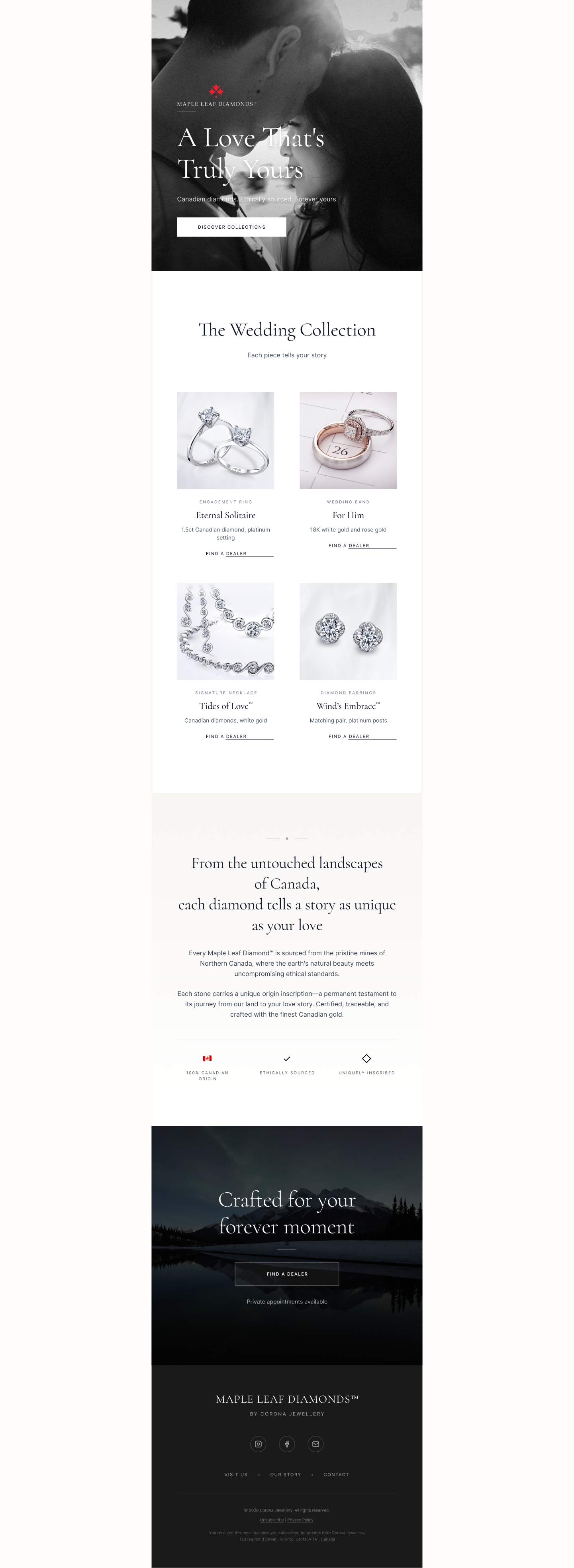
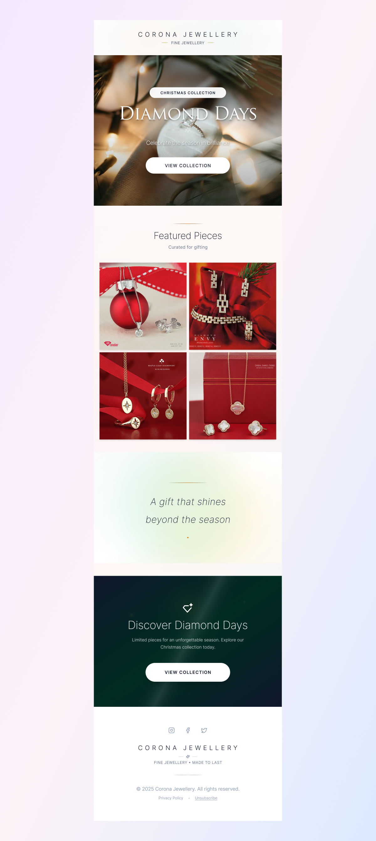
These emails were designed for Corona Jewellery, a fine jewellery brand with multiple in-house labels including Maple Leaf Diamonds. The challenge was creating communications that felt editorial and premium while still driving a clear path to purchase.
Retail / Luxury
Fine jewellery email operates at the aspirational end of the spectrum. The goal is to create a moment of desire before asking for action — not the other way around.
Key design decisions:
Full-bleed imagery used to set emotional tone before any product or copy appears
Generous whitespace and minimal text to let the product breathe
Typography chosen to signal brand positioning — serif for heritage and luxury
CTAs kept secondary to the visual experience — present but not aggressive
Modular layout structure so templates could be adapted for different campaigns and seasonal moments without rebuilding from scratch
WHAT MAKES EMAIL HARD
The constraint that makes email design useful training for everything else: you're designing for the reader who won't slow down. A clear reading order, a single primary action, and a layout that communicates in three seconds or thirty — that's the discipline.